

It’s that time of year, where we look at the NRL’s 2021 kits. This edition will include home, away, and any alternative jerseys when applicable.
Seasons: 2024 2023 2022 2021 2020 2019
BRISBANE BRONCOS
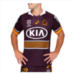
HOME: Brisbane’s new jersey is a modernised version of their classic strip. It’s predominantly maroon, with a handful of horizontal gold stripes topped and tailed by white stripes, and white and gold sleeve bands, topped off with an old-fashioned white collar. It’s one of their best home jerseys in years.

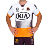
AWAY: their away strip echoes their old Super League jersey. It’s predominantly white, with maroon and white horizontal lines on the torso and a gold bottom, with a cool ‘V’ pattern running through it.

VERDICT: both home and away strips are a vast improvement on recent versions, echoing classic designs.
CANBERRA RAIDERS
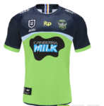
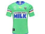
HOME: Canberra tend to keep their home jersey pretty simple: lime green with the traditional white, blue, and gold ACT stripes on the arms or chest. Their 2021 jersey is their biggest departure from this formula since the early 2000s. There’s blue on the shoulders and chest, a small grey line, and the usual green below that (with Canberra Milk returning as a major sponsor). It’s not as popular as their heritage jersey (more on that below), but it could grow on fans.

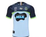
AWAY: the away jersey is similar to the home one, except the green is replaced by a blue/grey colour. It’s a bit strange, but usually away jerseys have a bit more license to be different, so that’s fine, and it’s a departure from the usual white away jerseys.

HERITAGE: when Canberra’s 2021 jerseys were announced, fans got VERY excited with this one, especially as some though that this classic mid-90s design (complete with the retro Milk logo, which is pure genius by the designers) was the home strip. While it’s only the heritage strip, it hasn’t stopped fans from snapping up the pre-orders. A petition was even started to change this one to the home jersey. While it won’t happen, hopefully the heritage strip gets a few outings; regardless, expect to see a lot of these in the stands at GIO Stadium.

VERDICT: the heritage jersey is the runaway winner here.
CANTERBURY-BANKSTOWN BULLDOGS
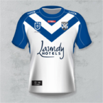
HOME: the Bulldogs’ home jersey – like the team itself – has received a fresh coat of paint, with blue shoulders, arms, and collar, along with the traditional blue chevrons (with the second V now in full). It’s a small change, but it looks nice.
AWAY: the away jersey is a simple colour reversal of the home jersey.

VERDICT: sometimes small changes are the best, and it’s enough to convince Bulldogs fans to add them to their collection.
CRONULLA-SUTHERLAND SHARKS
HOME: the home jersey hasn’t changed much, with the classic 80s design retained. No need to change something that works so well.
AWAY: the Sharks have gone for a predominantly black look for the away jersey, with a blue fade on the shoulders. It looks good.

VERDICT: two decent jerseys for the Sharks as they stick to the basics.
GOLD COAST TITANS
HOME: the Titans’ strong finish to 2020 has carried over to their new jerseys. The home one has dark blue shoulders, a big yellow stripe on the chest, and a light blue torso. This works because it’s kept simple: no shoehorning of awkward sword patterns here.

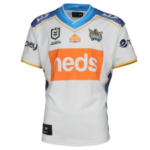
AWAY: the away jersey is just as good – if not better – than the home strip. It’s 95% white, with blue shoulders and sides and thin yellow stripes. It’s simple and it works.
VERDICT: the Titans should push for the finals in 2021, and they’ll sure look good doing it.
MANLY-WARRINGAH SEA EAGLES
HOME: no change to Manly’s home jersey.
AWAY: no change to their away jersey either, keeping the mid-90s golden era design.
VERDICT: no change.
MELBOURNE STORM
HOME: Melbourne’s home jersey is interesting: it’s predominantly purple, with a dark blue chevron, and the smaller yellow lines on the chest and arms suggests a throwback to classic designs. It looks more “Melbourne-y” than last year’s jersey and is much neater.
AWAY: The Storm haven’t released their away jersey yet, though it could be similar to last year’s, which they wore in the victorious grand final.
VERDICT: The home jersey is a cleaner update from last year’s, falling back on the classic chevrons with a touch of yellow.
NEWCASTLE KNIGHTS
HOME: no change.
AWAY: no change.
VERDICT: no change.
NORTH QUEENSLAND COWBOYS
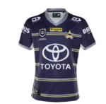
HOME: the Cowboys’ home jersey is great: it’s predominantly dark blue, with small grey and yellow horizontal sides and white side panels.

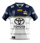
AWAY: a riff on their 25th anniversary jersey, with dark blue shoulders and chest, white below that, and small grey horizontal stripes.

VERDICT: the home jersey’s had a nice update, and the away jersey borrows from their classic design.
PARRAMATTA EELS


HOME: the Eels’ home jersey echoes the 80s, as it’s mostly yellow with a solid blue stripe along the chest and blue shoulders.
AWAY: Parramatta have stuck to their late 80s/early 90s strip. A wise choice.
VERDICT: the Eels keep it retro for both home and away.
PENRITH PANTHERS
HOME: virtually no change to Penrith’s home jersey.
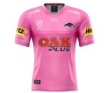
AWAY: the Pink Panther jersey returns, with a slight update. It’s been a solid fan favourite.

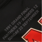
HERITAGE: celebrating 30 years since their first premiership, Penrith bring back the original ‘licorice allsorts’ jersey (with the 1991 NSWRL Grand Final score on the back of the jersey). Like Canberra’s heritage jersey, expect the Panthers’ version to sell out quickly.


VERDICT: like Canberra’s, Penrith’s heritage jersey is a standout.
ST. GEORGE-ILLAWARRA DRAGONS
HOME: no change to the classic ‘Red V’ design.
AWAY: while the away jersey is predominantly red in a nod to the Steelers, there’s also a big red V. It’s a bit messy, to be honest.

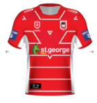
HERITAGE: celebrating their 100th anniversary as the St George Dragons, the heritage strip has simple red and white horizontal stripes.


VERDICT: the away jersey is strange, but the heritage jersey makes up for it.
SOUTH SYDNEY RABBITOHS
HOME: a small change for Souths, with the cardinal and myrtle stripes on the shoulders now, with black side panels and a black logo.


AWAY: a simple flip, with white side panels and a white logo.


VERDICT: a simple change to the shoulders makes these jerseys look closer to the classic Souths design.
SYDNEY ROOSTERS
HOME: The Roosters have made a minor change to their classic Tri-colours jerseys, as the white chevron is thicker. It’s enough to make Roosters fans want to add this to their collection.
AWAY: The Eastern Suburbs boys have made a larger change to their away jersey though. The red and blue chevrons have been swapped, with the blue now a darker shade and much bigger across the top.


VERDICT: A small change for the home jersey (which’ll keep the traditionalists happy), while the away jersey receives a nice upgrade/colour swap.
NEW ZEALAND WARRIORS

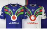
HOME: wisely, the Warriors have kept their retro Auckland Warriors design, with a slightly darker blue.
AWAY: the Auckland design carries over, with a white torso below the blue, green, and red on the shoulders and the chest.
VERDICT: the Warriors stick to the classic design. It works.
WESTS TIGERS
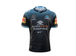
HOME: new apparel partners Steeden have introduced a small change: with a black base, a huge white chevron, and small arrow-ish orange chevrons above and below that. It’s…different.
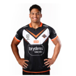
AWAY: after their brilliant white away jersey, the Tigers have switched it up with a predominantly orange away jersey. It’s not as good as last year’s.

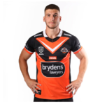
VERDICT: Wests Tigers jerseys can be hard to get right, and this feels like a step back, especially swapping the white away strip for orange.
Do you agree with our verdicts? Head to our Facebook page to comment


